- 2024-12-13
- posted by Htay Min Kaung
- System
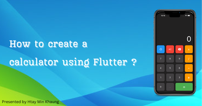
How to create a calculator app using Flutter ?
Good day to our valued readers!
My name is Htay Min Khaung, and I work as a web developer at WIT Lab. Today, I will explain you through the step-by-step process of creating a calculator mobile application using the Flutter framework. Flutter is the open source framework with a lot of built-in widgets (components) to create a beautiful, natively compiled, multi-platform applications from a single codebase. Flutter is also supported and used by Google.
Now, let start coding to get a beautiful calculator mobile application.
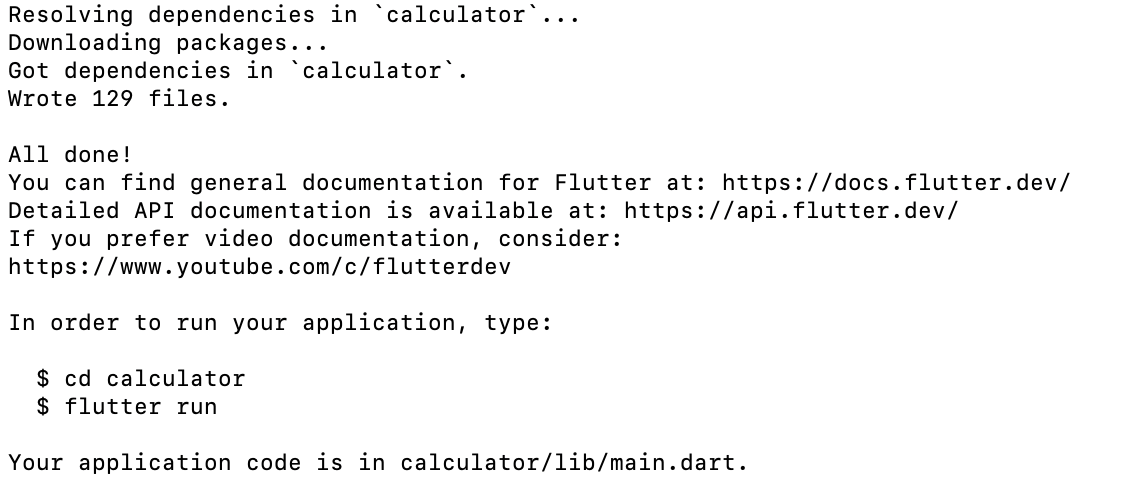
Firstly, run "flutter create calculator" in the terminal (command prompt).
After you have run the command, you will see ss shown in the screenshot below...
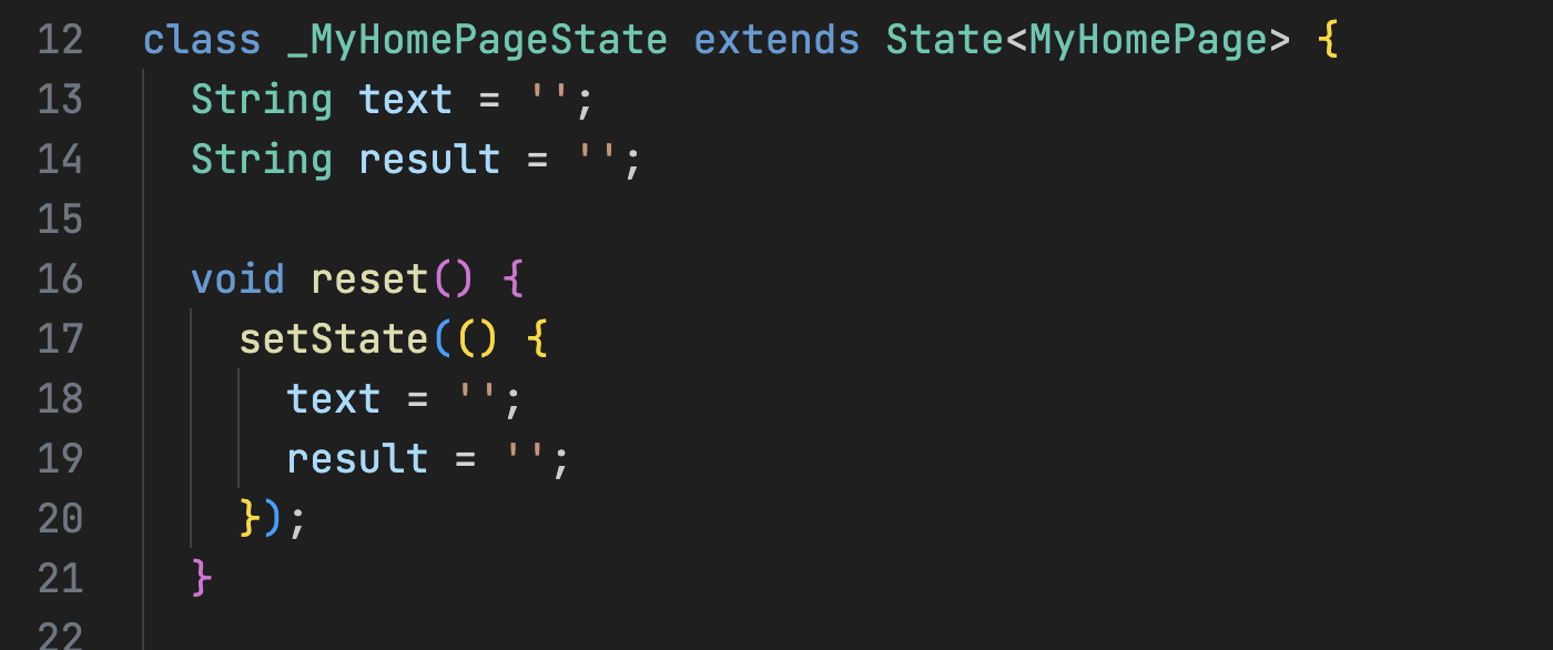
Then, enter command "code calculator". The project will open in the VS Code editor. In the project folder list, we will use the 'lib' folder to write the UI code. We need to add two packages: math_expressions and auto_size_text.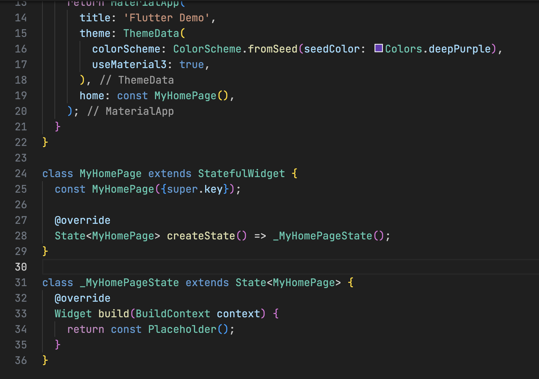 Add two variables named 'text' and 'result'. The 'text variable will store the user's input, including numbers and operators, while the 'result' variable will store the calculated result. Next, create a function called 'reset' to reset both the 'text' and 'result' variables, as shown in the image below.
 The code is simple. Set both the 'text' and 'result' variables to empty, and use 'setState' to update the state within the MyHomePage Screen.
Add another function called 'calculate' that will evaluate the string expression and output the result.
The code is simple. Set both the 'text' and 'result' variables to empty, and use 'setState' to update the state within the MyHomePage Screen.
Add another function called 'calculate' that will evaluate the string expression and output the result.
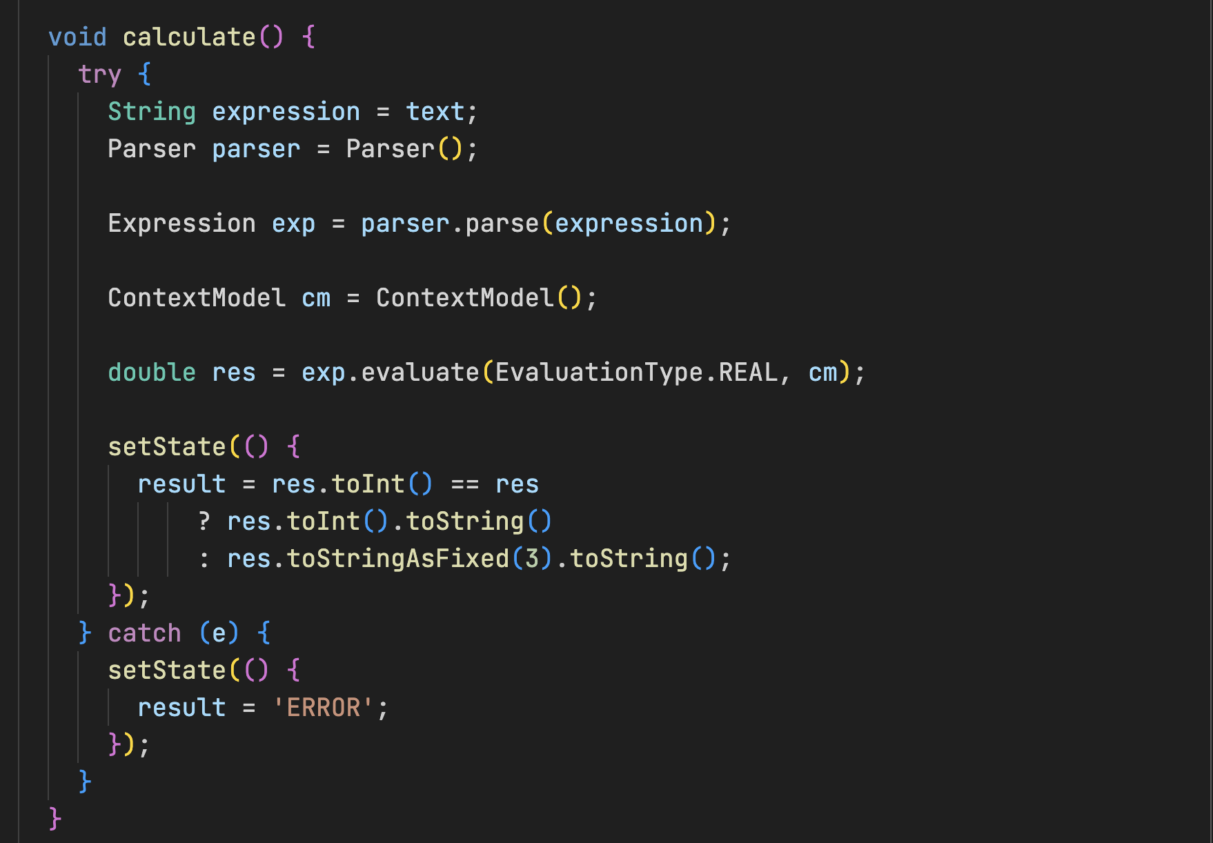 In the code, assign 'text' variable to variable 'expression'. The Parser is provided by a package like expressions to parse mathematical expressions. The Expression object represents the parsed mathematical expression. The parser verifies the syntax for correctness and prepares the expression for evaluation. Once validated, the expression processes the input data and returns the calculated result. Convert the output to number and and truncate the floating-point number to three decimal places. If an error occurs, set the result to 'ERROR'.
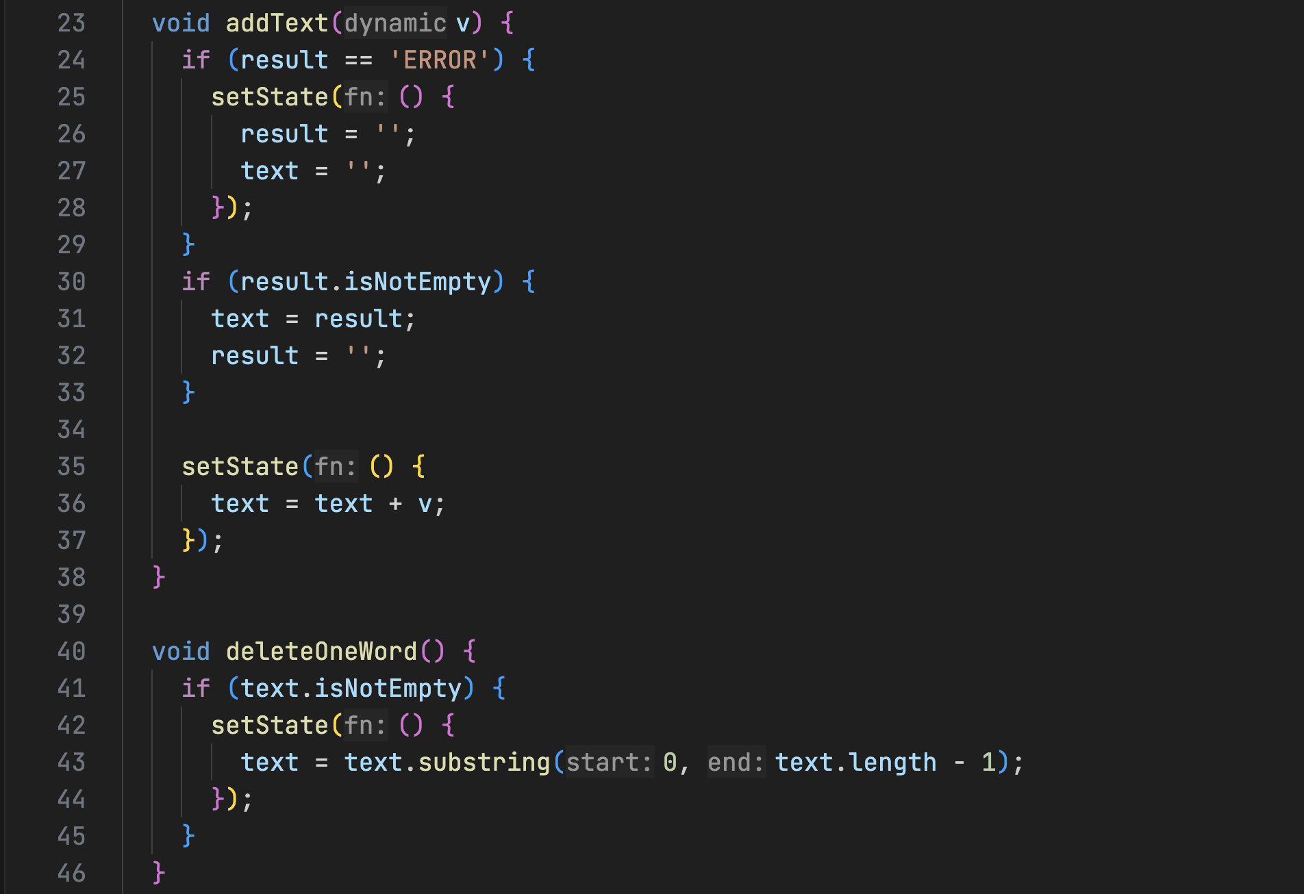 Two functions named "addText" and "deleteOneWord" will be added. "addText" will handle to add the user input data to variable "text". If the result is "ERROR", it will reset both the "result" and "text" variables. If result has the value, the "result" value will be transferred to the "text" variable and the "result" variable will be reset. The "deleteOneWord" functionfunction will remove the last character from the user's input, like the behavior of the 'Backspace' key on a keyboard.
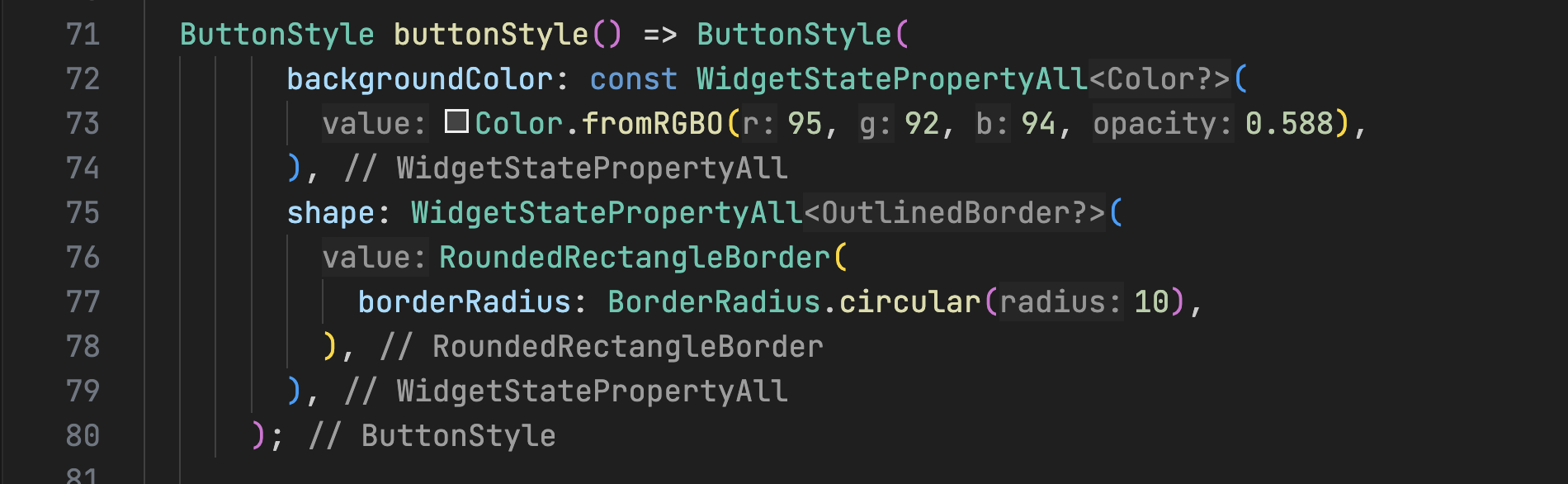 A new property named "buttonStyle", of type ButtonStyle, will be added to allow easy customization of button styles. The default button style will have a grey color and 10pt rounded corners.
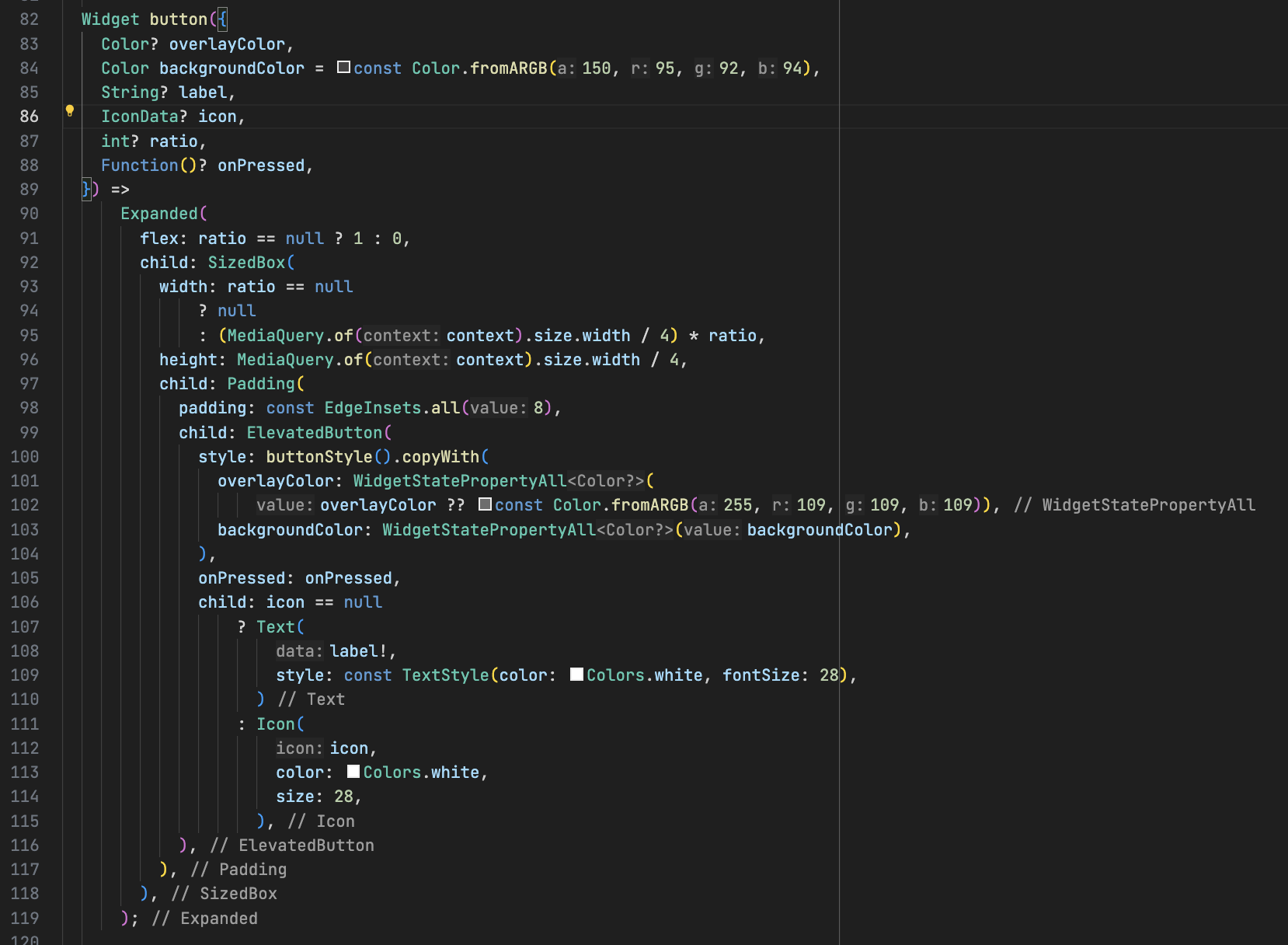 The button widget is a customizable button with parameters for overlay color, background, label, icon, font size, aspect ratio, and onPressed action and will be used for all buttons in the calculator application. Adding customizable parameters to the button will make it easier to adjust its appearance, resulting in a more flexible and polished UI design.
In the button parameters, overlayColor is for color fading when user press the button while backgroundColor sets the button's background color, label is the text displayed on the button and icon defines the icon shown. ratio parameter is used the button ratio for "=" button as it takes up twice the width of the other buttons.
Now, change the code "return const Placeholder(); to the following code:
The button widget is a customizable button with parameters for overlay color, background, label, icon, font size, aspect ratio, and onPressed action and will be used for all buttons in the calculator application. Adding customizable parameters to the button will make it easier to adjust its appearance, resulting in a more flexible and polished UI design.
In the button parameters, overlayColor is for color fading when user press the button while backgroundColor sets the button's background color, label is the text displayed on the button and icon defines the icon shown. ratio parameter is used the button ratio for "=" button as it takes up twice the width of the other buttons.
Now, change the code "return const Placeholder(); to the following code:
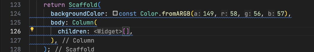 "Scaffold" is essential, and the background color of the screen will be set to grey. The screen will be divided into two sections using "column" widget: one to display the user's input and the other to display the buttons.
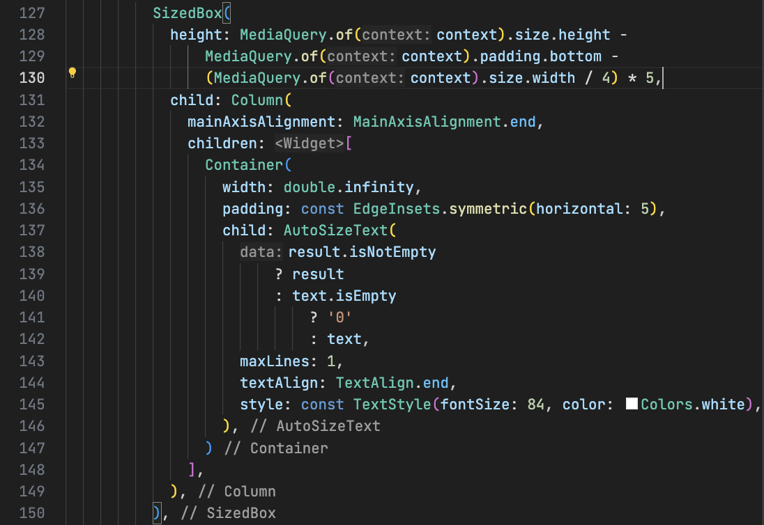 For the user input display, the bottom padding will be removed from the screen height, and the display area will occupy 5 times the 1:4 ratio of the screen width, as the buttons will be arranged in 4 horizontal columns. The AutoSizeText package, added earlier, automatically adjusts the font size of the display based on the length of the user's input. Now that we have the upper section of the UI design in place, let's add the buttons to handle the user's input.
Add the following code the bottom of the code show above imaage.
For the user input display, the bottom padding will be removed from the screen height, and the display area will occupy 5 times the 1:4 ratio of the screen width, as the buttons will be arranged in 4 horizontal columns. The AutoSizeText package, added earlier, automatically adjusts the font size of the display based on the length of the user's input. Now that we have the upper section of the UI design in place, let's add the buttons to handle the user's input.
Add the following code the bottom of the code show above imaage.
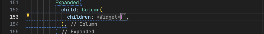 "expanded" will take all remaining spaces on the screen and "column" will be used to add 5 columns of the buttons.
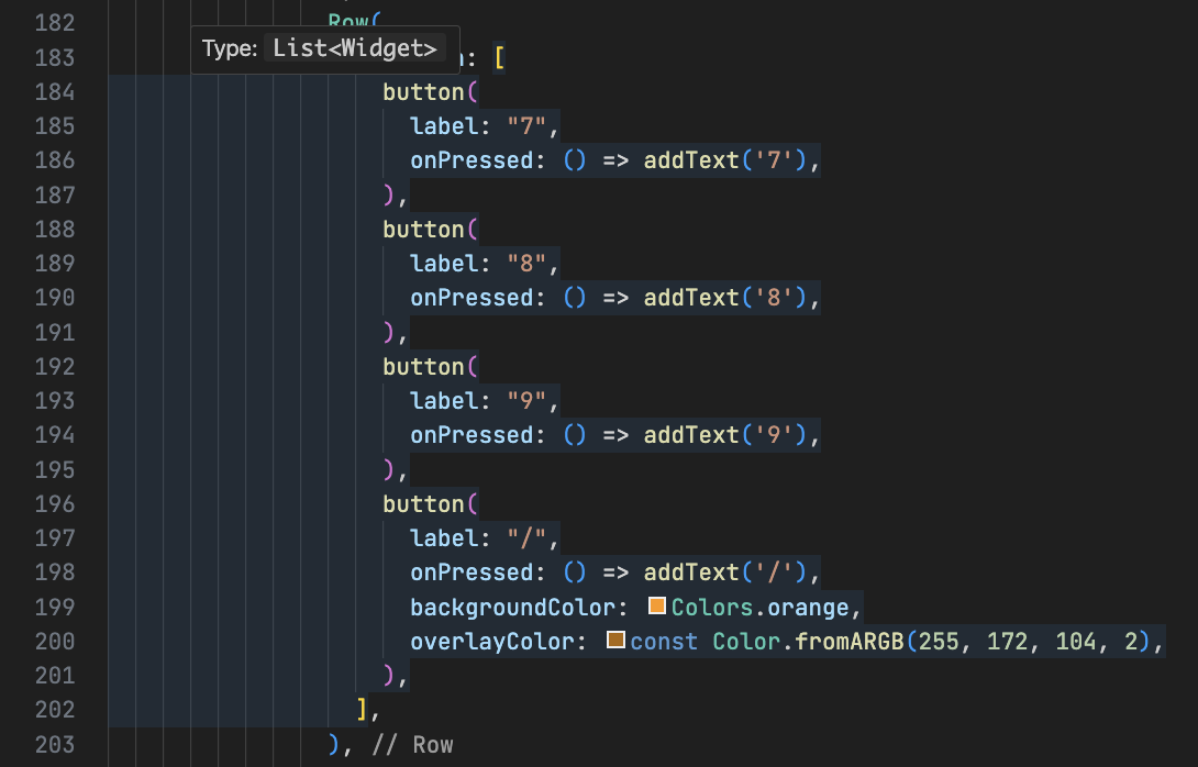
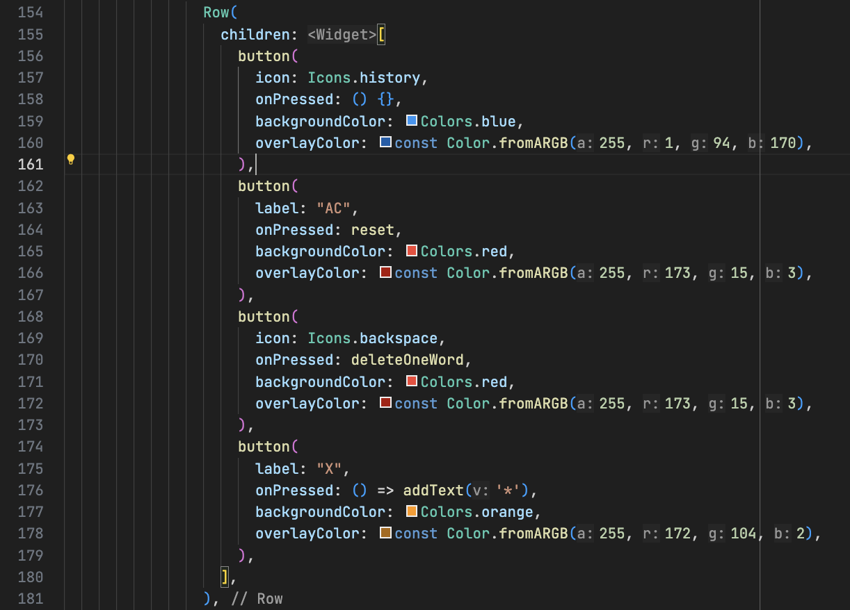 The uppermost row will contain 4 buttons:
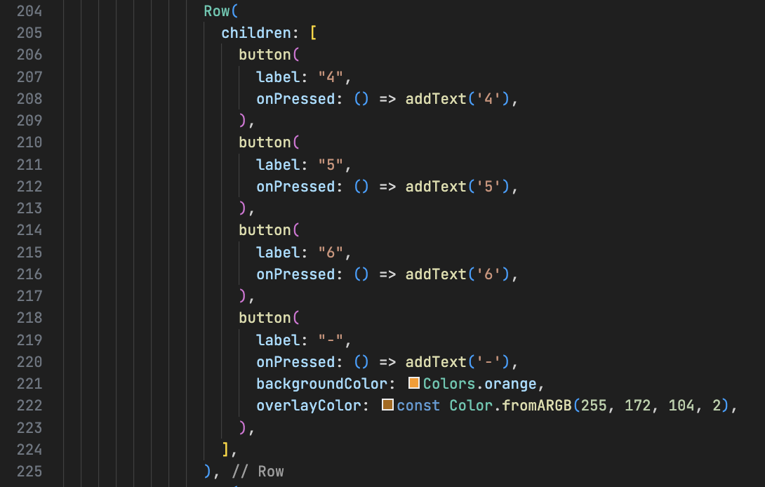
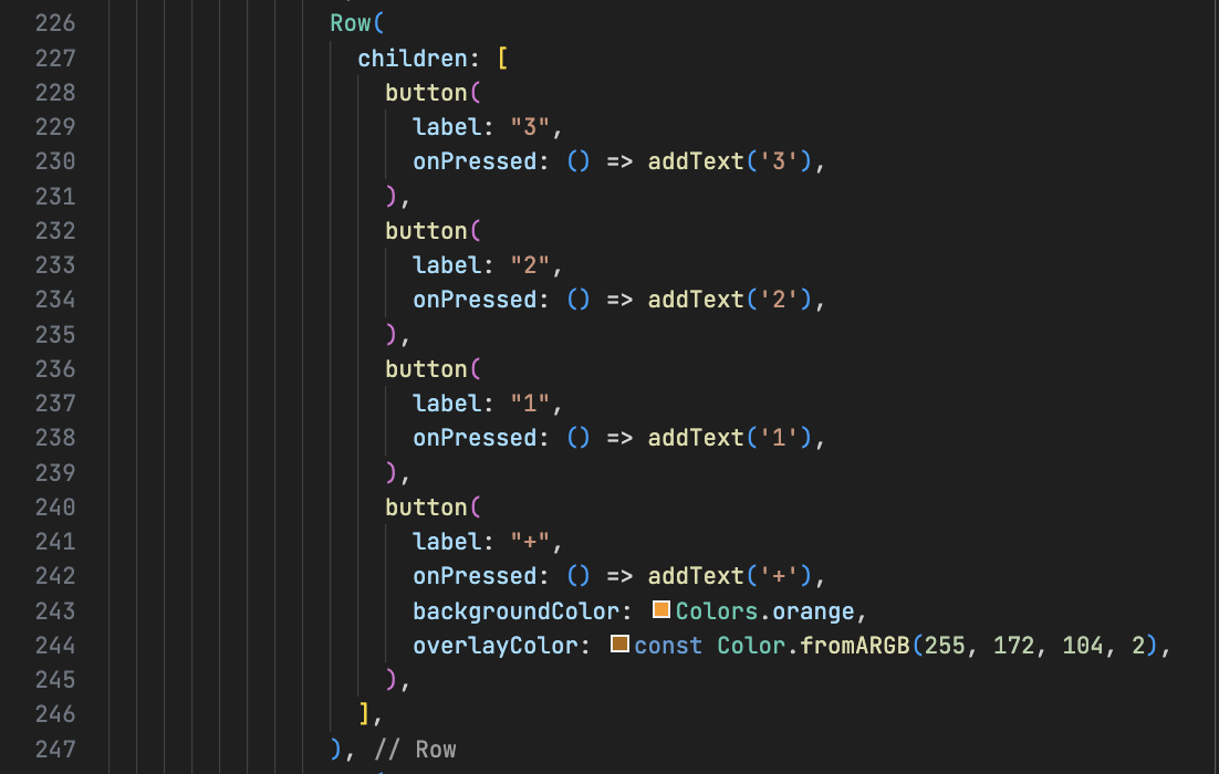
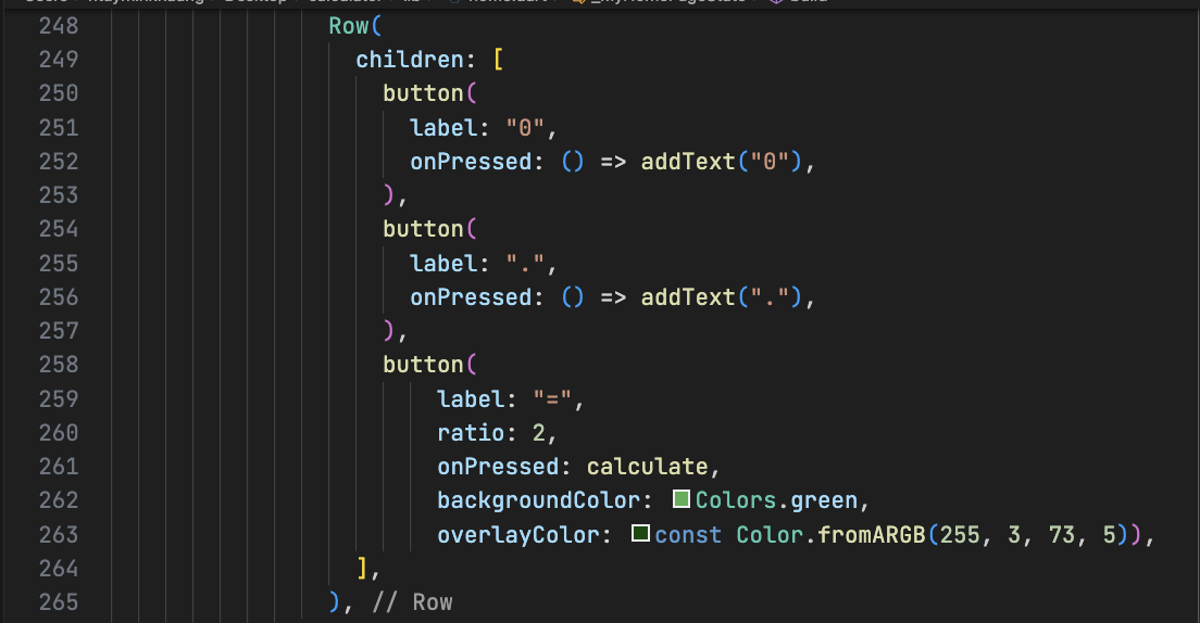 The buttons will replicate the functionality of the addText function, while the last button, the = button, will call the calculate function to process and evaluate the user's input.
After executing the code above, a calculator with an attractive UI design will appear.
Thank you for taking the time to read through this post. I hope you found it helpful. Wishing you a wonderful day ahead!
The buttons will replicate the functionality of the addText function, while the last button, the = button, will call the calculate function to process and evaluate the user's input.
After executing the code above, a calculator with an attractive UI design will appear.
Thank you for taking the time to read through this post. I hope you found it helpful. Wishing you a wonderful day ahead!
Then, enter command "code calculator". The project will open in the VS Code editor. In the project folder list, we will use the 'lib' folder to write the UI code. We need to add two packages: math_expressions and auto_size_text.
Math Expression Package
https://pub.dev/packages/math_expressionsAuto Size Package
https://pub.dev/packages/auto_size_text In the lib/main.dart file, you'll find some code that Flutter generates by default for a demo. We will delete lines 16 to 30, as well as lines 39 to the end of the file. After deleting the code, you may encounter an error on line 19. To fix this, remove "title: 'Flutter Demo Home Page'" from the MyHomePage(...) constructor. It will still show red line under MyHomePage. Now, let's create a StatefulWidget named 'MyHomePage'. On line 24, type 'stf' and a popup will appear. Select 'Flutter Stateful Widget' from the list. After you click it, Flutter will generate a widget named 'MyWidget'. Without clicking or pressing any arrow keys, simply type 'MyHomePage' to replace 'MyWidget', and the red underline will disappear. The code will look like the image below.
Add two variables named 'text' and 'result'. The 'text variable will store the user's input, including numbers and operators, while the 'result' variable will store the calculated result. Next, create a function called 'reset' to reset both the 'text' and 'result' variables, as shown in the image below.
The code is simple. Set both the 'text' and 'result' variables to empty, and use 'setState' to update the state within the MyHomePage Screen.
Add another function called 'calculate' that will evaluate the string expression and output the result.
In the code, assign 'text' variable to variable 'expression'. The Parser is provided by a package like expressions to parse mathematical expressions. The Expression object represents the parsed mathematical expression. The parser verifies the syntax for correctness and prepares the expression for evaluation. Once validated, the expression processes the input data and returns the calculated result. Convert the output to number and and truncate the floating-point number to three decimal places. If an error occurs, set the result to 'ERROR'.
Two functions named "addText" and "deleteOneWord" will be added. "addText" will handle to add the user input data to variable "text". If the result is "ERROR", it will reset both the "result" and "text" variables. If result has the value, the "result" value will be transferred to the "text" variable and the "result" variable will be reset. The "deleteOneWord" functionfunction will remove the last character from the user's input, like the behavior of the 'Backspace' key on a keyboard.
A new property named "buttonStyle", of type ButtonStyle, will be added to allow easy customization of button styles. The default button style will have a grey color and 10pt rounded corners.
The button widget is a customizable button with parameters for overlay color, background, label, icon, font size, aspect ratio, and onPressed action and will be used for all buttons in the calculator application. Adding customizable parameters to the button will make it easier to adjust its appearance, resulting in a more flexible and polished UI design.
In the button parameters, overlayColor is for color fading when user press the button while backgroundColor sets the button's background color, label is the text displayed on the button and icon defines the icon shown. ratio parameter is used the button ratio for "=" button as it takes up twice the width of the other buttons.
Now, change the code "return const Placeholder(); to the following code:
"Scaffold" is essential, and the background color of the screen will be set to grey. The screen will be divided into two sections using "column" widget: one to display the user's input and the other to display the buttons.
For the user input display, the bottom padding will be removed from the screen height, and the display area will occupy 5 times the 1:4 ratio of the screen width, as the buttons will be arranged in 4 horizontal columns. The AutoSizeText package, added earlier, automatically adjusts the font size of the display based on the length of the user's input. Now that we have the upper section of the UI design in place, let's add the buttons to handle the user's input.
Add the following code the bottom of the code show above imaage.
"expanded" will take all remaining spaces on the screen and "column" will be used to add 5 columns of the buttons.
The uppermost row will contain 4 buttons:
- The History button
- The AC button, which resets the result and text variables
- A Backspace button with an icon that deletes one character from the user input, calling the deleteOneWord function we added earlier
- The 'X' button, representing multiplication (*)
The buttons will replicate the functionality of the addText function, while the last button, the = button, will call the calculate function to process and evaluate the user's input.
After executing the code above, a calculator with an attractive UI design will appear.
Thank you for taking the time to read through this post. I hope you found it helpful. Wishing you a wonderful day ahead! 


